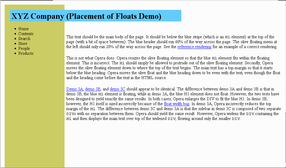
This text should be the main body of the page. It should be below
the blue stripe (which is an H1 element) at the top
of the page (with a bit of space between). The blue header should
run 60% of the way across the page. The olive floating menu at the
left should only run 20% of the way across the page. See the reference rendering for an example of a
correct rendering.
This is not what Opera does. Opera resizes the olive floating element
so that the blue H1 element fits within the floating
element. This is incorrect. The H1 should simply be
allowed to protrude out of the olive floating element. Secondly,
Opera moves the olive floating element down to where the top of the
text begins. The main text has a top-margin so that it starts below
the blue heading. Opera moves the olive float and the blue heading
down to be even with the text, even though the float and the heading
come before the text in the HTML source.
Demo 3A, demo
3B, and demo 3C should appear to
be identical. The difference between demo 3A and demo 3B is that in
demo 3B, the blue H1 element is floating, while in demo
3A, the blue H1 element does not float. However, the two tests have
been designed to yield exactly the same results. In both cases, Opera
enlarges the DIV to fit the blue H1. In demo 3B, however, the H1 itself
is sized incorrectly because of the float
width bug. In demo 3A, Opera incorrectly reduces the top margin of
the H1. The difference between demo 3C and demo 3A is that
the sidebar in demo 3C is composed of two separate DIVs
with no separation between them. Opera should yield the same
result. However, Opera widens the DIV containing the
H1 and then displays the main text over top of the widened
DIV, flowing around only the smaller DIV.